Image panels
An image panel lets you feature an image that supports text and a call to action (CTA).
Features
- Present an image beside your text and CTA (stacked on mobile view).
- Highlight a specific CTA or piece of information.
Guidelines
Keep your body text:
- under 300 characters for image panels with a CTA link
- under 368 characters for image panels without a CTA link.
Avoid:
- more than 2 stacked image panels – consider whether a group of cards or panes might be more appropriate.
- zig-zagging of image panels (switching the image from left to right) as it decreases the ability for users to scan for information.
- too many image panels on a page as this can reduce the impact of highlighting key information.
Media guidelines
Make sure you crop your image following the image guidelines.
Check different screen sizes before you publish (mobile, tablet, desktop) to make sure that your image doesn't crop people's faces or key parts of the image. Image panels change shape depending on:
- whether local navigation is displaying on the page
- the device your user is viewing it on.
Choose the right block
You'll use different components depending on if your page has local navigation.
Use a single pane or card for pages with local navigation. This ensures the image scales well on the smaller width page.
Use a single pane when any of the following apply:
- you need a CTA button
- you need link text to provide additional context for users that the pane content alone doesn't provide
- you don't need links
- you need multiple links per pane.
Use a single card when:
- your intent is for users to click through to a different page
- you don't need a CTA button
- you don't need link text to provide additional context
- you want the whole card to be clickable.
Example single pane
Example single card

Adding a single pane or card to a landing page
Create a section, then add your pane to the section. You can only add panes to the Card/pane section (Design System) section type.
Add a Card/pane grid section
- Select 'Add section'.
- Choose the layout ‘Card/pane section (Design System)’.
- Complete the relevant fields:
- Administrative label (optional) – this label isn’t visible to users. Use it to help other editors understand the intent of a section.
- Title – don't use a section title when you're only creating a single pane.
- Description – don't use this description field if you're only creating a single pane.
- Type – select ‘Pane’ or 'Card' as the type, depending on your content needs..
- Heading level – Choose which heading level your individual panes should have. Consider what headings are above your content on the page.
- Variant – select the 'Image' variant.
- Number per row – select '1'. Only select multiples if you're adding a group of cards or panes.
- Student type (Study website only) – choose from 'Domestic', 'International' or 'Both'.
- Select 'Add section'. This adds your section to the landing page.
Add a pane or card block
- Select 'Add block' in your new section.
- Select 'Create content block'.
- Choose 'Pane' or 'Card'.
- Complete the relevant fields for your content.
- Image
- Select 'Add media' to add an image to your block.
- Either upload a new image or choose from the images in the media library. Use the filters to narrow your search.
- Tick the required image.
- Select 'Insert selected'.
- Title – add a title for your pane or card. Your title should be a clear and concise snapshot of other content in the block.
- Description (optional) – use the WYSIWYG to add supporting text. For panes, you can add and any CTAs or buttons. Generally, your description shouldn’t be any longer than a few sentences.
- Links (panes only – optional) – add a URL if you want the pane to link to other content. If the linked page is on the same site, type the page name and select it rather than pasting an absolute URL.
- Link text (panes only – optionall) – if you’ve added a link or multiple links using the 'Links' field, you’ll need to add link text. Use link text that sets clear expectations for users about the content it links to.
- Add another item (panes only – optional) – select ‘Add another item’ to add additional links. You can add multiple links if it’s appropriate for the content.
- Image
- Select 'Add block'. This adds your pane single pane to the section.
Use an image panel for pages without local navigation (such as campaign pages). This ensures the image is more prominent on the largest page width.
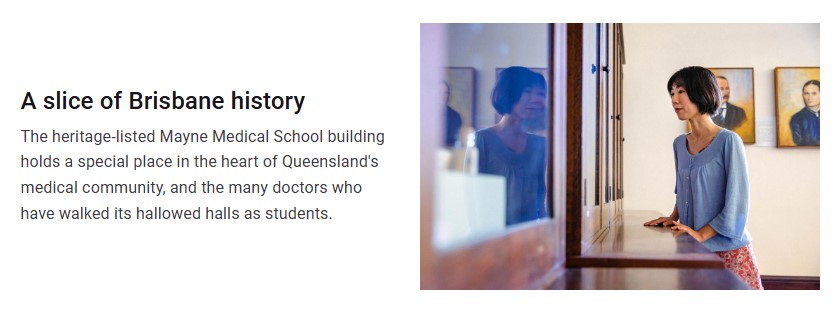
Example image panel

Adding an image panel to a landing page
Create a section, then add your image panel (block) to the section. You can only add image panels to the Section (Design Systems) section type.
Add a section
- Select 'Add section'.
- Choose the layout ‘Section (Design Systems)’.
- Complete the fields:
- Administrative label (optional) – This label isn’t visible to users. Use it to help other people editing your page understand the intent of the section.
- Student type (Study website only) – choose from 'Domestic', 'International' or 'Both'.
- Select 'Add section'. This adds your section to the landing page.
Add an image panel block
- Select 'Add block' in your new section.
- Select 'Create content block'.
- Choose 'Image panel'.
- Choose which fields to complete depending on the purpose of your content.
- Title – add a title for your panel. Use titles that set clear expectations for users about the content in the image panel and links.
- Body – outline the main idea within the character limits, don't overload with information. Link to other content if you need to provide more detail.
- Media
- Select 'Add media' to add an image or video to your image panel.
- Either upload a new image or video or choose an existing one from the media library. Use the filters to narrow your search.
- Tick the required image.
- Select 'Insert selected'.
- CTA links – add a URL you want the panel to link to. If the linked page is on the same site, type the page name and select it rather than pasting an absolute URL.
- Link text – use short and meaningful link text that sets clear expectations for users about the content the image panel links to.
- Block style – choose from 'Media left' or 'Media right'. In most cases, use 'Media right' to help users scan your page.
- Panel background – choose from 'White', 'Bordered' or 'Shaded'.
- Student type (Study website only) – choose from 'Domestic', 'International' or 'Both'.
- Select 'Add block'. This adds your image panel to the section.