Cards and panes
This guide is for sites built in the new version of Drupal (like Study or Scholarships).
If you're working on a Drupal 7 (UQ Standard) site, see card grids on Drupal 7.
Cards and panes group related content to make it easier for users to scan, read and identify information.
You can only add cards and panes to landing pages.
The guidelines on this page are for grouping content. If you want to highlight a single piece of content, consider an image panel.
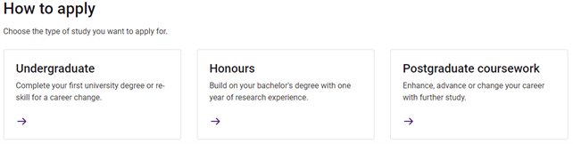
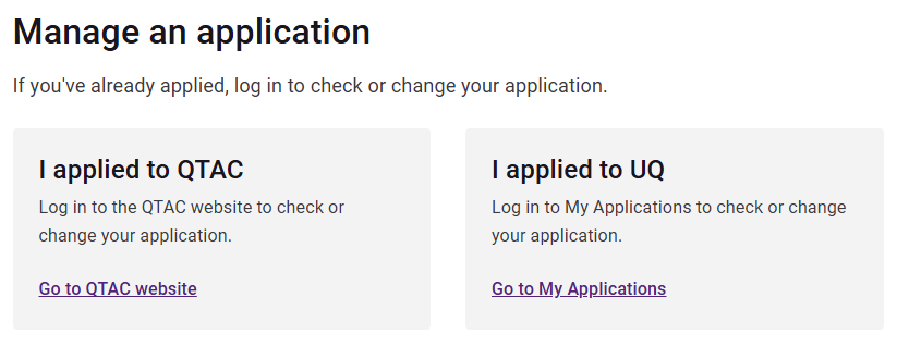
Cards link to other webpages and provide context for users to make decisions about which page to visit next. Use cards in most cases when you want to group several related options for users to navigate to.
Features
- 1 link per card.
- The whole card is clickable (including image). The increased touch target size makes cards more accessible and user-friendly than panes with text links.
Guidelines
Use cards when:
- you have a series of related links for users to choose between
- the intent of the content is to click through rather than staying on the page and reading further content
- you only need a small amount of content to help users understand where the link will take them.
Do:
- use rows of 2-3 cards
- give users context for where the link will take them
- feature 1 piece of information per card
- keep your text short, simple and meaningful
- use image guidelines if your cards will have images.
Avoid using when you:
- need a large amount of text to give users context
- have differing amounts of text (avoid having one with lots of text and one with not much)
- need link text that provides additional context that the card content alone doesn't provide – use a pane
- need multiple links per card –use a pane
- don't need links – use a pane.
Variants
Variants control the style that displays to users. Using visual elements (such as images or icons) in cards allows for different content to stand out and provides additional context to help users quickly distinguish between pieces of information.
When you create a card, you can choose from the following options:
Text
Use text cards to group a high volume of cards or when images and icons wouldn't support the meaning of the content.
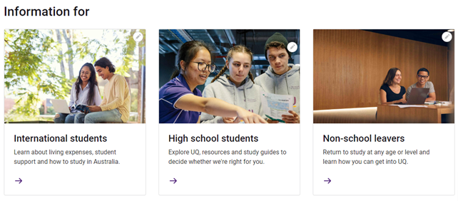
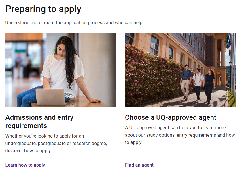
Image
Use cards with images to highlight important content on a page. Use images that are meaningful and help users understand the content. Don’t use images for decorative purposes.
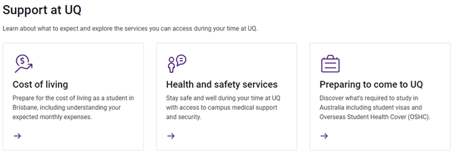
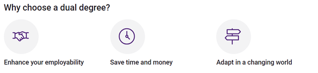
Icon
Use cards with icons to help users understand and scan for content relevant to them. Don’t use icons for decorative purposes.
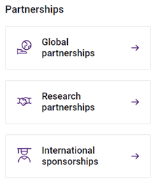
Icon nav
Use icon cards to help users understand and scan for content relevant to them. Icon nav cards are visually the same as icon cards. However they condense on mobile view so only the card title and icon are visible. This helps users navigate more efficiently on smaller screens.
Make sure the card title provides enough context by itself.
Adding cards to a landing page
Create a section, then add cards (blocks) to the section. You can only add cards to the Card/pane section (Design System) section type.
Add a card grid section
- Select 'Add section'.
- Choose the layout ‘Card/pane section (Design System)’.
- Complete the fields:
- Administrative label (optional) – This label isn’t visible to users. Use it to help other editors understand the intent of a section.
- Title (optional) – Add a title to display above the cards. Use keywords and keep your title short and meaningful.
- Description (optional) – Depending on your content needs, use the WYSIWYG (text editor) to add supporting text. Generally this shouldn’t be any longer than a few sentences.
- Type – Select ‘Card’ as the card type.
- Heading level – Choose which heading level your individual cards should have. Consider what headings are above your content on the page. If you're using the Title field for your card section, your cards should have H3 headings.
- Variant – Select the variant. Variants control the style that displays to users.
- Number per row – Select the number of cards that should appear per row. In most cases, select rows of 2 or 3. You can only have 4 cards in a row on pages that don’t have local navigation. Cards will stack on smaller screens.
- Student type (Study website only) – choose from 'Domestic', 'International' or 'Both'.
- Select 'Add section'. This adds your section to the landing page.
Add a card block
- Select 'Add block' in your new section.
- Select 'Create content block'.
- Choose 'Card'.
- Choose which fields to complete depending on which variant you selected and the purpose of your content.
- Image (optional)
- Select 'Add media' to add an image to your card.
- Either upload a new image or choose from the images in the media library. Use the filters to narrow your search.
- Tick the required image.
- Select 'Insert selected'.
- Icon (optional) – choose one from the drop-down list provided.
- Title – add a title for your card. Use titles that set clear expectations for users about the content they link to.
- Description (optional) – outline the main idea with the minimal possible information, don't overload with information as the card links to more detail.
- Link – add the URL you want the card to link to. If the linked page is on the same site, type the page name and select it rather than pasting an absolute URL.
- Image (optional)
- Select 'Add block'. This adds your card to the section.
- Follow the same process to add your remaining cards.
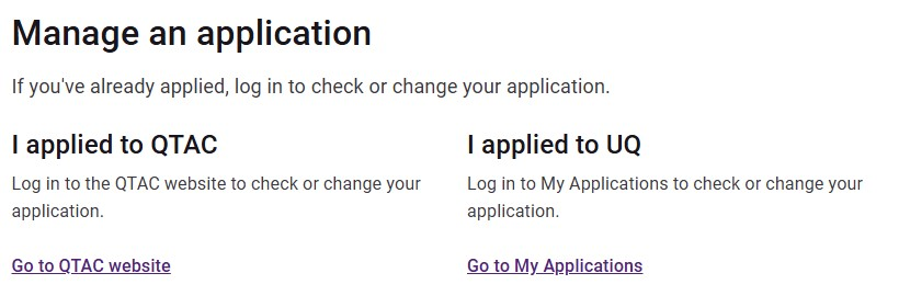
Panes provide more flexibility than cards. Use panes to group related links or small pieces of information. Use panes instead of cards when cards won't suit the content.
Features
- Can have no links or multiple links.
- Can have link text for additional context.
- Only the link text is clickable (not the entire pane). Cards are more accessible and user-friendly than panes for single links.
Guidelines
Use panes for grouping related content when any of the following apply:
- you don't need links
- you need multiple links per pane
- you need link text that provides additional context for users that the pane content alone doesn't provide
- you only need a small amount of content per pane.
Do:
- use rows of 2-3 panes
- give users context for where any links will take them
- use keywords
- keep your text short, simple and meaningful
- use image guidelines if your panes will have images.
Avoid using when:
- you have large amounts of text
- your content only has one CTA per pane – use cards.
Variants
Variants control the style that displays to users. Using visual elements (such as images or icons) in panes allows for different content to stand out and provides additional context to help users quickly distinguish between pieces of information.
When you create a pane, you can choose from the following options:
Text
Use text panes when grouping a high volume of panes or when images and icons wouldn't support the meaning of the content.
Text shaded
Use shaded panes to create additional separation and visually group sections of content.
Image
Use panes with images to highlight important content on a page. Select images that are meaningful and help users understand the content. Don’t use images for decorative purposes.
Icon
Use panes with icons to help users understand and scan for relevant content. Don’t use icons for decorative purposes.
Icon shaded
Use shaded panes to create additional separation and visually group sections of content. Icons help users scan for and understand relevant content. Don’t use icons for decorative purposes.
Icon large
Use panes with large icons to highlight important content on a page. Don’t use icons for decorative purposes.
Adding panes to a landing page
Create a section, then add panes (blocks) to the section. You can only add panes to the Card/pane section (Design System) section type.
Add a pane grid section
- Select 'Add section'.
- Choose the layout ‘Card/pane section (Design System)’.
- Complete the fields:
- Administrative label (optional) – this label isn’t visible to users. Use it to help other editors understand the intent of a section.
- Title (optional) – add a title to display above the panes. Use keywords and keep your title short and meaningful.
- Description (optional) – depending on your content needs, use the WYSIWYG to add supporting text. Generally this shouldn’t be any longer than a few sentences.
- Type – select ‘Pane’ as the type.
- Heading level – Choose which heading level your individual panes should have. Consider what headings are above your content on the page. If you're using the Title field, your cards should have H3 headings.
- Variant – select the variant. Variants control the style that displays to users.
- Number per row – select the number of panes that should appear per row. In most cases, select rows of 2 or 3. You can only have 4 panes in a row on pages that don’t have local navigation. Panes will stack on smaller screens.
- Student type (Study website only) – choose from 'Domestic', 'International' or 'Both'.
- Select 'Add section'. This adds your section to the landing page.
Add a pane block
- Select 'Add block' in your new section.
- Select 'Create content block'.
- Choose 'Pane'.
- Choose which fields to complete depending on which variant you selected and the purpose of your content.
- Image (optional)
- Select 'Add media' to add an image to your pane.
- Either upload a new image or choose from the images in the media library. Use the filters to narrow your search.
- Tick the required image.
- Select 'Insert selected'.
- Icon (optional) – choose one from the drop-down list provided.
- Title – add a title for your pane. Your title should be a clear and concise snapshot of other content in the pane.
- Description (optional) – outline the main idea with the minimal possible information, don't overload with information. Link to other content if you need to provide more detail.
- Links (optional) – add a URL if you want the pane to link to other content. If the linked page is on the same site, type the page name and select it rather than pasting an absolute URL.
- Link text (optional) – if you’ve added a link or multiple links, you’ll need to add link text. Use link text that sets clear expectations for users about the content it links to.
- Add another item (optional) – select ‘Add another item’ to add additional links. You can add multiple links if it’s appropriate for the content.
- Image (optional)
- Select 'Add block'. This adds your pane to the section.
- Follow the same process to add your remaining panes.
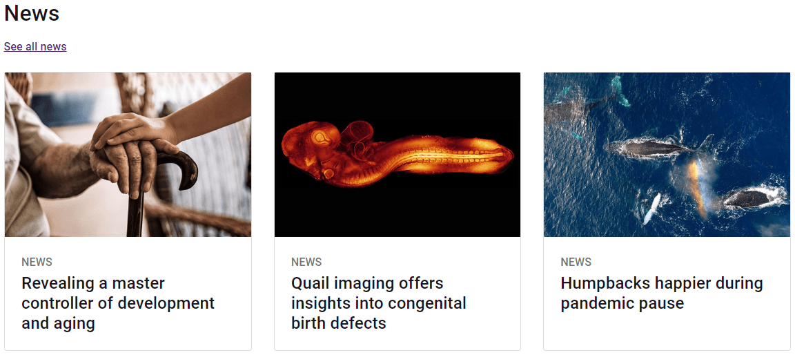
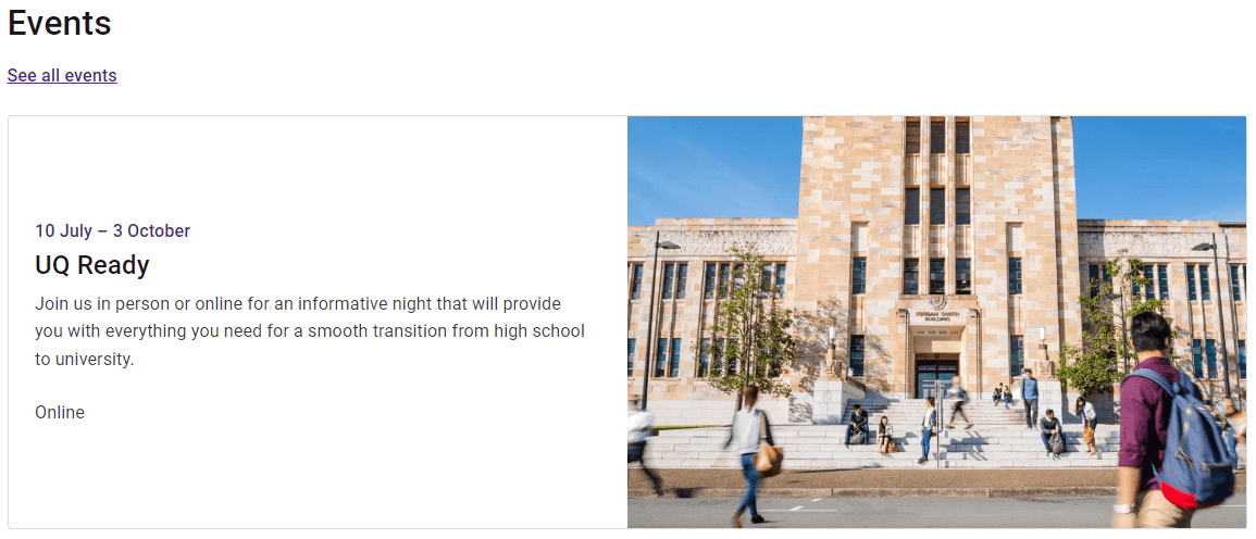
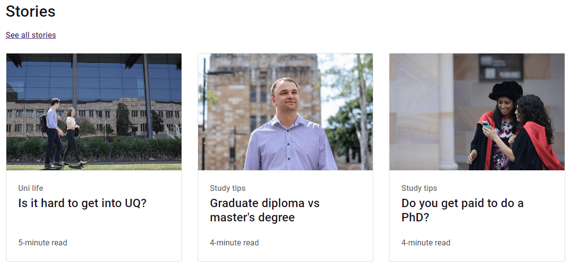
News/event cards display links to events, news articles or stories that live on other UQ websites. Use these cards when you can't use event lists or article lists.
You need to update events, news and stories regularly to keep your webpages looking current. Don’t use the news/event card component unless you’ve planned a regular update or removal schedule first because they don't update automatically.
If you're linking to events or stories that live on the site you're editing on, use the event list or article list components, which update automatically.
Features
- 1 link per card.
- The whole card is clickable (including image). The increased touch target size makes cards more accessible and user-friendly than panes with text links.
Guidelines
Use news/event cards when:
- you need to link to an event, news article or story that's hosted on a different UQ website.
Do:
- use rows of 1–3 cards
- give users context for where the link will take them
- make sure you add a relevant title to your section
- keep your text short, simple and meaningful
- use image guidelines for card images.
Avoid using:
- for links to events, news articles or stories already on the site you're creating content on – use article lists or event lists.
Variants
When you create a news/event card, you can choose from the following options:
News
Use news cards to link to news articles hosted on other UQ sites.
Event
Use event cards to link to events hosted on other UQ websites.
Story
Use story cards to link to stories on other UQ websites.
Add news/event cards to a landing page
Create a section, then add news/event cards (blocks) to the section. You can only add news/event cards to the Card grid (Design Systems) section type.
Add a card grid section
- Select 'Add section'.
- Choose the layout ‘Card/pane section (Design System)’.
- Complete the fields:
- Administrative label (optional) – This label isn’t visible to users. Use it to help other editors understand the intent of a section.
- Title – Add a title to display above the cards. The standard titles are 'News', 'Events' or 'Stories'. All card sections should have titles.
- Description (optional) – Depending on your content needs, use the WYSIWYG to add supporting text. This is usually a link to more content of the same type. For example: 'See all news' or 'See all events'.
- Type – Select ‘News/Events card’ as the card type.
- Variant – Select the variant. Variants control the style that displays to users.
- Number per row – Select the number of cards that should appear per row. In most cases, select rows of 1–3. Cards will stack on smaller screens.
- Student type (Study website only) – choose from 'Domestic', 'International' or 'Both'.
- Select 'Add section'. This adds your section to the landing page.
Add a card block
- Select 'Add block' in your new section.
- Select 'Create content block'.
- Choose 'News/Events card'.
- Choose which fields to complete depending on which variant you selected and the purpose of your content.
- Image (optional)
- Select 'Add media' to add an image to your card.
- Either upload a new image or choose from the images in the media library. Use the filters to narrow your search. In most cases, use an image from the content you're linking to.
- Tick the required image.
- Select 'Insert selected'.
- Date or topic – choose standard text depending on your content:
- For news articles, enter 'NEWS' in all caps.
- For events, enter the date for the event. For example: '12 April 2025' or '12–15 April 2025'.
- For stories, enter the topic. You can find this in the article 'Edit' screen. For example: 'Careers', 'Study tips'.
- Title – add a title for your card. This should usually be the same title as your linked content.
- Description (optional) – give a brief summary of the linked content. You usually don't need this if you're using rows of 3 cards.
- Date, location or read time
- For news articles, leave this field blank.
- For events, enter the location for the event. For example: 'Online' or 'St Lucia campus'.
- For stories, enter the read time. You can find this in the article 'Edit' screen. For example, '2- minute read'.
- Link – add an absolute URL you want the card to link to.
- Image (optional)
- Select 'Add block'. This adds your news/event card to the section.
- Follow the same process to add your remaining news/event cards.