Using sections to style panels
What is a section?
A section is a wrapper that adds extra fields and theming options to a component on a panel page.
Sections should be applied to most panels, because they:
- contain content to the same central column width
- adjust spacing and alignment around the panel
- let you add a title, summary and footer
- provide additional styling options.
When you create a panel, the instructions will tell you whether you should apply section styling.
Use sections to:
- centre panels on a page.
Section style shouldn't be used on:
- hero banners
- default pages headers
- breadcrumbs
- any panels designed to display at full width.
How to add a section
Sections can be added and edited by:
- site builders.
Use the in-place editor to apply a section to a panel:
- Click 'Customize this page' in the black Drupal menu at the bottom of the page.
- Click the paintbrush icon in the grey bar at the top of the panel.
- Select 'Section' from the list of options and click 'Next'.
- Enter a title for panel, if required. This will appear on the page.
- Use the 'Title element' drop-down list to select a heading level for the title (if relevant).
- Add summary, if relevant, to give context to the panel content.
- Change styling options under 'Customise display options', as required.
- Click 'Save'.
- Click 'Save' in the black Drupal menu at the bottom of the page to publish the changes.
Styling options
Sections offer a range of styling options for your panel. You can change the:
- padding
- background colour, tint or pattern
- background image
- text colour
- layout
- scrolling options.
When you apply a section, these options appear under the 'Customise display options' header:
Top and bottom spacing
These control the spacing around the panel. You can adjust top and bottom spacing separately:
- Default padding adds the standard amount of space.
- Large padding adds more space than default padding.
- Extra large padding adds more space than both large and default padding.
- No padding means the panel will sit flush against the panel above or below it.
Theme
Here, you can change the text colour, image tinting and background colour or design for the panel.
For text colour, choose between:
- Light text will make the panel title, summary and footer text display in white. Works well with dark tint.
- Dark text will make the panel title, summary and footer text display in black. Works well with light tint.
For image tinting, choose between:
- Dark tint dims the image and makes light text easier to see.
- Light tint adds a white layer over the image and makes dark text easier to see.
For background colours or designs, choose between:
- Default gives the panel a white background.
- Shaded background gives the panel a grey background.
- Dark tint adds a black background to panels without images.
- Noise texture is a light grey speckled background.
- Black pinstripe is thin diagonal grey stripes on a black background.
- Cardboard is a grey textured background.
- Mesh texture is a grey background with the appearance of fine mesh.
- Dark grid texture is thin grey boxes on a black background.
- Light grid texture is thin grey boxes on a white background.
- Thatched texture is a grey background with tiny diagonal squares.
Layout
This changes the alignment of the title, summary and footer in the section. There are three layout options:
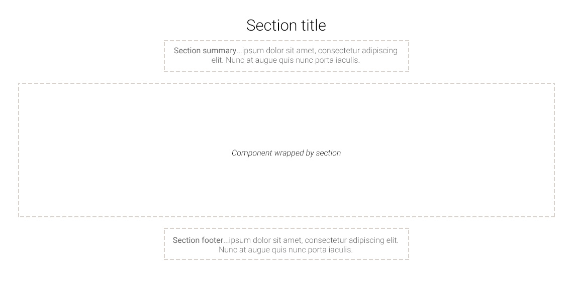
Single column, centered
In this layout, the section title, summary and footer are centered:
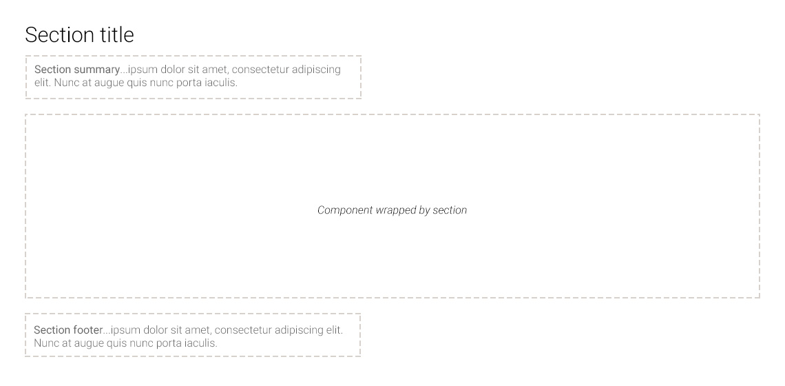
Single column, left-aligned
In this layout, the section title, summary and footer are left-aligned:
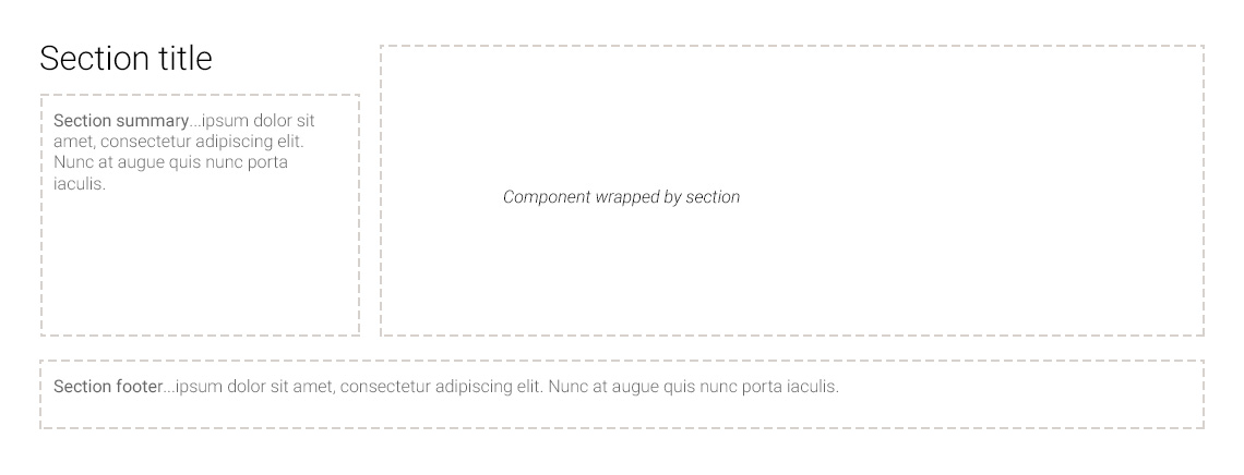
Two column, left-aligned
In this layout, content displays in two columns:
- the section title and summary are in the left column
- the component is in the right column
- the footer is left-aligned and extends across both columns, under the component.
Utility
Here, you can select special options that control how content in the panel will display:
- Allow overflowing content prevents any long drop-down lists being cut-off below the panel. This can affect the background tint you've selected, so check that the panel displays as expected.
- Parallax adds parallax scrolling to your background image, so stays fixed relative to content in the foreground.
Best practice
- Add brief and clear panel titles (up to 6 words) and summaries (1-2 lines).
- Choose combinations of background and text colour to create a contrast ratio that is easy to read.
- Optimise images for the web and crop them appropriately.
- Alternate section styles down the page to create visual distinction between different content.
Fields
Fill in all required fields and as many optional fields as possible to provide the best user experience.
Field name | Required field? | Function |
|---|---|---|
Section title | Optional | Title for the panel. This will display on the page. |
Title element | Required if you have entered a title | Select the heading level (H2 to H4) for the title. Defaults to 'H2'. |
Summary content | Optional | Introductory or summary text that displays under the title. |
Footer content | Optional | Footer text that displays at the bottom of the panel. |
Background image | Optional | Click 'Browse' to select an image from file browser. |
Top spacing | Required | Select from the options to increase or decrease the padding at the top of the panel. Defaults to 'Default padding'. |
Bottom spacing | Required | Select from the options to increase or decrease the padding at the bottom of the panel. Defaults to 'Default padding'. |
Theme | Required | Choose a colour, tint or pattern for the background. Defaults to 'Default' (transparent background). |
Theme > Text colour | Optional | Controls text colour of the section title, summary and footer. This won't affect text in the panel. |
Layout | Required | Controls the position of the title, summary and footer in the section. Defaults to 'Single column, centered'. |
Utility > Allow overflowing content | Optional | Prevents drop-down lists from being cut off if they go below the bottom of the panel. This can affect tints used on the section, so double check the display. |
Utility > Parallax | Optional (only used if you have added a background image) | Tick to enable parallax scrolling. The background image will stay fixed relative to the foreground content. |